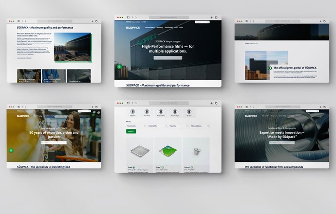
SÜDPACK has been online with a new design, simple navigation and real added value to its new website since January 2022 and according to the company is website that sets new standards in communication, particularly in terms of user-friendliness and the depth of information.
Throughout the ambitious relaunch project, the basic idea of the customer journey was the primary focus. The new online concept is therefore based on a brand-new page structure with an intuitive, simple user interface and appealing content that is easy to reach.
Navigation through the main pages and subpages is clear, logical and self-explanatory. Special attention was paid to making sure that all of the subpages have clear descriptions so website visitors can be led directly to the desired content while also being animated to visit additional pages.
Simple product filters make it easy to find specific products for a wide variety of applications – and lead to the desired destination with just a few clicks. It is possible to filter by application or product group and also based on the packaging system or sustainability aspects. For example, it is possible to search for packaging solutions for sausage, meat, vegan products or dairy products. If visitors are more interested in sustainable packaging concepts, they are specifically redirected to the subpages that focus on sustainability. Moreover, it is also possible to search for films with specific features, such as whether they are resealable, peelable or offer barrier functions.
Said Valeska Haux, VP Strategic Marketing at SÜDPACK: “In the digital world, attractively presenting your product and service portfolio is no longer enough. Content is the key to success and added value for our customers is our goal. This is why we have created a great deal of new content in order to engage visitors with our specialist knowledge and industrial expertise, our pioneering solutions and also our passion for everything we do.”
An optimal user experience is not only provided by improved navigation and appealing content, but also by a harmonious design concept. The focus while planning the new website was therefore most particularly on its layout, which now very much does justice to the brand SÜDPACK. Harmonised design elements, clear structures, concise key points and visual accents provide a better overview of product options.
Yet another highlight is the news teaser for a quick overview. It features current press releases as well as exciting product and market developments. For more visit suedpack.com


